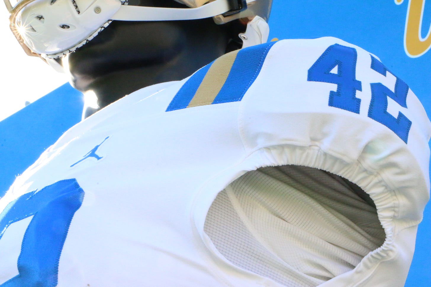
Photos: UCLA Football Jumpman Uniform Review
UCLA's new Jumpman uniforms are a step back from Under Armour, but still better than the ones the Bruins used to have from Adidas.
Before I get started with our Jumpman Uniform Review and Photos, I have a bit of housekeeping which I have to do. We remain tremendously grateful for all the support everyone has provided by subscribing since we debuted at the start of a pandemic.
That said, in order to keep The Mighty Bruin covering all of UCLA sports the way we would like to, we need some individuals to step forward to write for us.
It goes without saying that producing a blog which covers UCLA like all of you have been accustomed to over the years takes A LOT of work. But, if there aren’t enough hands to help distribute that work among, that becomes impossible. So, if you like what you see hear and might be interested in giving us a hand, please take a look at one of our recent articles which describes what we’re looking for.
Then, just email me.
We are really looking for at least four people to join our team. Hopefully, that’s you.
Now, onto the Jumpman Uniform Review and Photos….
I waited to pass judgment on the new UCLA football uniforms until seeing them in person.
The new unis made their official public debut on Saturday at the UCLA Football Rose Bowl open house.
The biggest criticism of the Jumpman uniforms is that the UCLA Stripe is shorter than it was with Under Armour. Now, having seen other teams which use the UCLA Stripe who use Nike as a supplier, this came as no real surprise. All one had to do was look at the Indianapolis Colts, the New York Jets, Ole Miss and LSU to get a good idea as to what the UCLA Stripe would look like under Nike.
The good news is that it’s nowhere near as bad a the “UCLA Stubs” that they had devolved into under Adidas.
The issue has to do with the way the jerseys are designed. There is a large seam across the jersey which connects the torso portion of the jersey to the shoulder portion. That seam apparently prevents Nike from continuing the stripe further in length on both the front and back of the jersey.

The coolest part of this uniform update has to be the gold facemask on the helmet. While the gray facemask is certainly classic. The gold facemask just looks cool.
In my opinion, the worst part of the new uniform is the pants. They just aren’t gold enough for my liking. That may have to do with the fact that, in high school, my team had gold pants which were shiny gold on the front, just like Notre Dame had back in the late 80s. I’d personally prefer pants that were similar to that.
Of course, the Jumpman logo is prominent on both the jersey and the pants. The pants also have the UCLA script on the leg opposite the Jumpman logo. The addition of the script certainly falls into the very cool category.
Go Bruins!!!
Thanks again for supporting The Mighty Bruin. Your paid subscriptions make this site possible. Questions, comments, story ideas, angry missives and more can be sent to to @TheMightyBruin on Twitter.


Interesting bit of history: https://dailybruin.com/2017/07/24/tracing-the-ucla-stripe-through-history
I agree with you, Joe. These are fine. They're certainly better the adidas hash marks and I'm fine dumping the welching cheapskates at UA, but nothing will rival the perfect powder blue and gold of the late 80's for me. I don't know why we moved on from our classic color scheme. I also don't understand why a seam prevents a monster design conglomerate like Nike from continuing a stripe. Sure, it might be more work, but come on.